You get what you pay for
The word ‘Design’ understandably crops up quite a lot in my social media posts and clever algorithms ensure that I see advertisements catering to my specific interests. Or that’s the theory anyway… Technology really is a wonderful thing and I am as geeky as they come – I even worked at Apple for a while so that I could get up close to all the shiny goodness that makes life easier. Not everything can be aided by technology yet though, and creative imagination is a prime example.
I’ll admit that I would be lost without my studio full of equipment, and whilst I look back with nostalgia at the days of cutting, pasting, transfer lettering and hand rendering, I am thankful for the digitisation of design. My life is made easier and my creativity is actually really helped as I do things now in a matter of hours that would have previously taken days. Technology still hasn’t replaced imagination though and this is a key component of effective design. The weakest designs are the ones that follow cookie cutter formulas, or chase the latest visual trends that will be passé by the time the supporting written content is signed off.
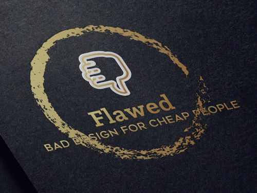
Facebook has recently been suggesting that I explore quick and easy online ‘solutions’ to logo design. Now it seems that all we need to do to come up with the perfect company logo is complete some basic fields of information. Simply pick a colour, choose a few logo examples you like, tick the box of the typeface that appeals, and as an optional extra, select a pretty shape. Voila! – your logo is finished within minutes and at a fraction of the cost of working with a pesky designer who will ask lots of difficult questions. These old fashioned questions may include things like the intended end-use, target demographics, accessibility requirements and any number of broader brand considerations.
Out of interest, I gave it a go. I explored precisely what I could get for the price of a few cups of coffee – or a glass of wine in London. I went in sceptical but even I wasn’t prepared for just how risible the end results would be.
Type was badly positioned and spaced with criminal kerning! In some cases elements of the ‘design’ didn’t even fit the shapes I’d picked, literally parts of words were cut off. Ugly, ungainly and unoriginal clichés literally appeared before my eyes that were only worthy of a client whose key brief instruction was to become a prize laughing stock. It was heartening to be reminded that you really do still get what you pay for.
Phew! My profession is safe for now, and our evil robot overlords have been vanquished for another day. Resistance is not futile after all and I’m going to keep on asking those awkward questions and ensuring that my clients get graphic design that is fit for purpose.
Live long and prosper.
- Blog
- Graphic Design, Logo design
- November 17, 2017
Related Posts