Ooh aah… just a little bit
Regular readers and anyone who knows me will know I like a bit of Eurovision. Keep reading, it’s interesting, honestly…
It’s not just about the music, it’s always fascinated me to observe how the host country decides to present the show. The staging, the songs, the cameras and all the obvious things are immediately evident but as a designer, it’s the smaller details that I enjoy scrutinising. Like any major event or corporation, Eurovision has a strict set of visual guidelines that are always at the heart of any localised identity that countries must use. This identity incorporates the main logo, its supporting heart graphic device, which fonts can be used and how flags should be used with the main logo etc.
This logo was introduced a decade ago to try to add some consistency and linkage each year across all media. Prior to its introduction, a whole new look and feel was designed annually by the host nation which sometimes worked, but mostly didn’t in my opinion. It made sense to unify it with one logo. Eurovision is supposed to be about unification through music and song, so it wasn’t a radical step to apply this philosophy to the logo too.
The resulting logotype was simple and did all it needed to do, allowing a little flexibility and national localisation and its introduction wasn’t controversial or questioned. In reality, the logo itself was always the smallest part of a broader identity that was applied by the host nation and acted as a simple link within a stronger and broader theme. It did its job well enough.
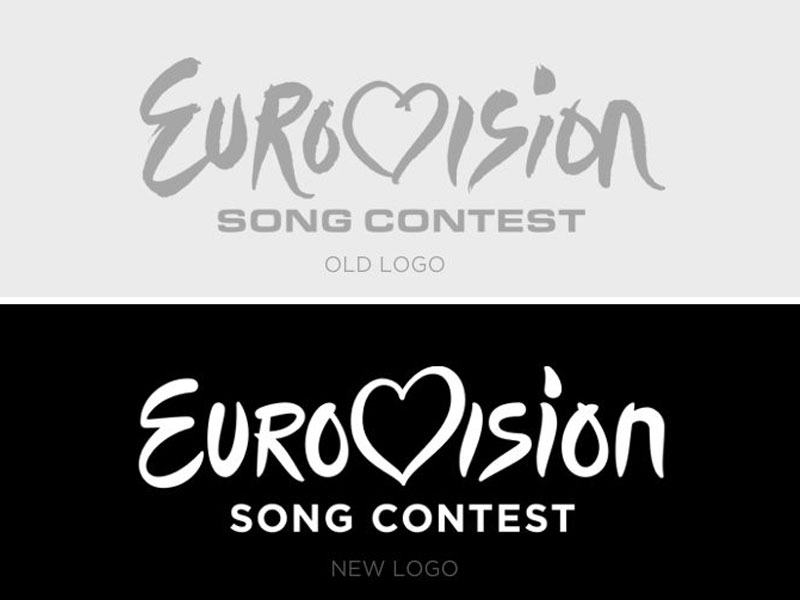
Yesterday, the European Broadcasting Union announced with mild fanfare that it was time for change. I have to say that it’s not really what I was expecting, but then again I thought it was kind of fine the way it was, so perhaps this very gentle tidying up is all that was needed? Fan reaction and the few people I have asked couldn’t really spot any difference, can you?
I believe in updating design when necessary but also hate tokenistic change and this has been done in time for the 60th anniversary. Is that reason enough to update? I’m not sure. I can see both sides but do wonder whether something more radical should have been considered, something much more different that would justify the effort a little more perhaps? This is such a gentle update that it’s debatable that it will even be noticed when seen in the broader thematic context each year.
The font that was originally used with the logo (for the words ‘song contest’) was previously Eurostile which I am sure was selected because of its name alone – lazy designer! It always looked like something from the early 1980s and I’m glad that it has finally been replaced with something contemporary – ‘Gotham’. It’s a safe and appropriate choice.
So, this fence I am sitting on is trembling below me and I still don’t know what I think. I like the update, I don’t agree it looks like the Disney logo which seems to be an easy criticism (it’s in friendly writing) and it does now look more modern. Yes, I like it. It probably was worth it but will anyone other than graphic designers really even notice come next year when Conchita Wurst’s beard is brushing against the microphone in Austria for the 60th Eurovision Song Contest. We shall see, no dream impossible.
- Blog
- August 1, 2014
Related Posts