Evolution not revolution
It’s not uncommon for me to be asked by clients to design a new logo for their business. That probably doesn’t come as a surprise considering I am a graphic designer and specialise in this sort of thing. What may be surprising is that I often ask Why? This is a common question that I ask myself constantly with design; why are you doing it in this particular way, what is it adding and is there a better way? Graphic design is all about solving problems and to do this, a lot of questions inevitably need to be asked and various approaches explored.
Considerable pressure is put on the humble logo, people can see it as the thing that can make or break their business and endless feedback is often sought from as many people as possible in a quest to get something that makes everyone happy. This, of course isn’t actually possible. The old adage of a camel being a horse that was designed by committee seems perfectly apt with this flawed approach. Feedback and research can of course be important, but it’s crucial to sift out what is mere opinion and what is real and valid guiding intelligence. It’s also even more important to ask the really big question, is a new logo actually needed?
The logo is the heart of a brand identity for businesses and is important, but it’s about so much more too. It’s also not the best decision to simply get a new logo because you’re a bit bored with what you have and could do with a change. The public become attached to logos – good, bad and ugly, and it’s wise to stick with something if it’s gently getting on with its job. Throw out the brand baby with the corporate bathwater at your peril!
I teach from time to time, and as part of my class, I cover this very subject. We look at big businesses – Apple, Shell, BBC etc. and examine how their logos have evolved. I use this word carefully as this is what the best brands do. Usually, they don’t start over from scratch, they update, improve and evolve. Like anything, there are trends in design and a logo can adapt without being completely reincarnated as a different creature to stay visually relevant.
I was recently commissioned by a client to carry out a creative audit on their large business. I was asked to look at everything and propose a strategy to harmonise and rationalise everything across all media – print, online, film and interiors. I didn’t recommend they get a new logo, I suggested we take the parts that work, enhance those and weed out the weak elements. Things can nearly always be improved but there is equal merit and skill in identifying when things should be left alone.
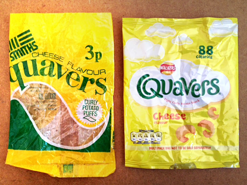
Yesterday, I came across an empty bag of Quavers from over thirty years ago. In 30+ years of munching, I’ve never really noticed the design changing, it has happened gently and certain elements have been retained to ease the transformation. Both packets in the image shown here are clearly my beloved Quavers, but are also vastly different and products of their time. This is a good example of the evolution of a design and a lovely thing to snack on too.
This blog post sadly wasn’t endorsed by Walkers Crisps and I got no free packets. You know where I am 🙂
- Blog
- April 28, 2014
Related Posts

Detail is important - Octoblog
[…] my last blog entry I mentioned that I had recently been commissioned to audit the brand identity of an organisation. […]